Excel Dashboards and Reports (Mr. Spreadsheet's Bookshelf)
The most effective reports and presentations are simple, direct, and visualize data that asks the right questions and supplies answers. Invest time in training yourself about data visualization techniques. If you need inspiration, visit the New York Times Visualization Lab (http://zqi.me/nytvlab).
Avinash Kaushik • Web Analytics 2.0: The Art of Online Accountability and Science of Customer Centricity
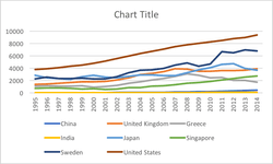
Good dashboards anticipate followups. A good dashboard says, "This dip, right here, which I know sticks out immediately? It was caused by our pricing change." A bad dashboard leaves the user wondering, "What happened then?" A good dashboard makes rates of change — week-over-week, year-over-year — immediately apparent. A bad dashboard leaves the use... See more
Andrew Bartholemew • Good dashboard, bad dashboard — Andrew Bartholomew
The Cognitive Style of PowerPoint
The document discusses the drawbacks of using PowerPoint for presentations, including its reduction of analytical quality, low resolution, and reliance on bullet lists that dilute thought.
inf.ed.ac.uk